Redesign the existing Spark Business site to create a place where any small business owner can determine which financial solutions will help them build their businesses.
Startup Samantha: a small business owner (SBO) with limited financial literacy who, regardless of the size or maturity of their business, seeks advice from others they trust.
Next Level Neil: a SBO with high financial literacy, who wanted detailed information about Capital One’s offerings to properly comparison shop between banks.

Create a Spark site that leverages stories from real small business owners to illustrate how Spark can help solve business problems with their product offerings.
Capital One had an internal reshuffle of personnel on teams and the project was put on hold. Why show a dead project? This project represents my thought process and collaboration through most stages of the UX process.
My role: Lead UX Designer (all assets displayed are mine, unless specified)
Our client, Capital One Spark Business, wanted to revamp their small business online presence. They wanted their site to feel more welcoming and useful to small business owners trying to keep their business running.
Their existing site had some navigational issues (too many subpages) but also failed to properly explain why certain products were useful for people. With this redesign, we needed to retain key content areas and e-commerce functionality.

Capital One Small Business is a unique division within a larger brand. I researched other overarching brands and how these companies have developed distinct digital properties for their underlying brands. I also explored how these companies balanced style and substance. We determined that we wanted Capital One Spark to feel connected to its larger brand to feel legitimate, but deviate visually to feel more comfortable to small business owners.
View Full Competitive Audit
We weren't allocated budget to conduct interviews through a vendor, so our content strategist and I mined our personal networks for small business owners.
Together, we conducted 10 interviews to gauge how small business owners behave, what their greatest challenges were, and what they needed from a financial institution. From these interviews, we determined that our audiences fell into two groups: new small business owners (who we named Samantha) and experienced ones (who we named Neil).

We conducted a stakeholder workshop to round out our interview findings with our client’s institutional knowledge.
Our stakeholders wrote persona descriptors on post its and arranged them chronologically to help us flesh out our journeys. We used this time to share our preliminary research and gauge its validity.
Our clients refined our initial personas. Samanthas, while typically new business owners, were more defined by their discomfort handling their company's finances. Neils, while typically more experienced, were more financially fluent. From our research, we had thought that our users would be divided by those were experienced business owners and those who were just starting out. This new distinction better informed our design decisions.

To synthesize this research, we developed a customer journey for each audience to find opportunities for Capital One to solve problems for each of these audiences.
Initially, we were under the impression that Neil (our more financially comfortable persona) would be our primary audience. As a result, we prioritized showcasing the best features of each product in the hero space for each product page, streamlining application processes (at the expense of doing more structured walkthroughs) and use our home page hero space to tell stories of more experienced small business owners.

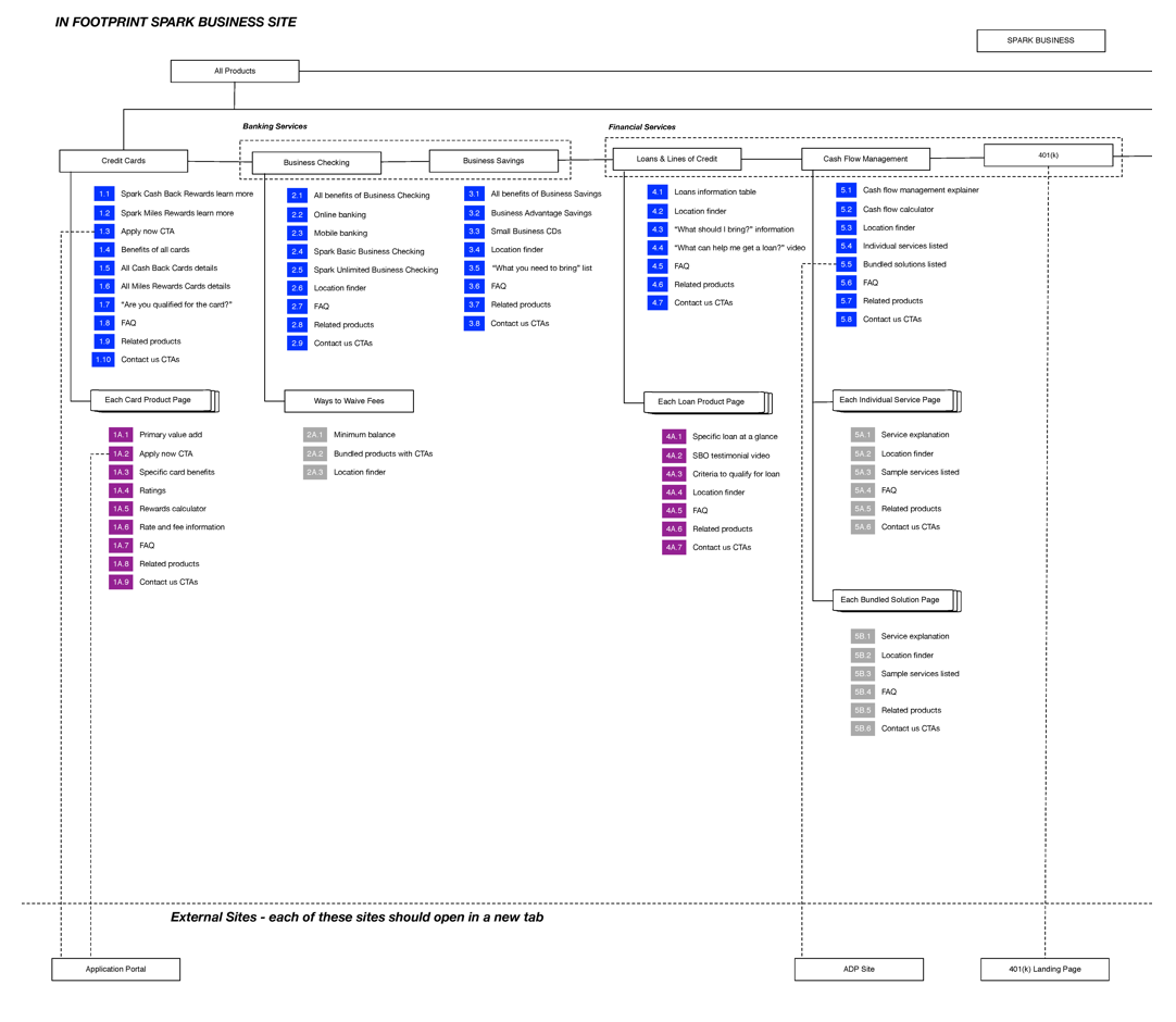
We created a hybrid sitemap and content outline to show prioritization of content and site structure.
We wanted to flatten the site to enable users to see the most salient information first. We determined salience based on our findings from our interviews. Based on e-commerce best practices, we had a single page for each product, all of which were accessible through the navigation.
We wrote out the content outline for each product page to ensure there was a consistent content flow for each page. We wanted to maintain consistency to create a mental model for people perusing multiple products to better digest information.
This is the left half of our sitemap
I designed my first round of wireframes for Neil: we’d use the home page to feature compelling small business stories, while being transparent and clear when explaining financial products.
The annotations are very detailed and include our rationale for that design feature (a client request).

I collaborated with the creative and design teams to concept three directions for the site’s home page experience. I didn't make these comps, but worked closely with our creative team to build these out to ensure an impactful experience.
Concept 1: employs a home page triptych featuring different business owners' hands, as a way to posit a user within the small business experience. Each triptych directed people to different areas of the site.
Concept 2: uses an aerial view of a business owner's desk featuring different objects familiar to people who've had sleepless nights trying to keep their business afloat (coffee cup, eraser). Users could pan this desk and click on objects to enter different business owner's stories, each of which featured a suite of Spark products.
Concept 3: show the animated faces of business owners as links to their stories (featuring multiple products)

After presenting our first round of wireframes and site concepts, our key client changed. After presenting our research to them, they decided that Samantha should be our primary user instead.
As a result, we redesigned our product pages to feature key stories from small business owners. We also broke down each key product into the different steps of how people would use it.
Unfortunately, this new point of contact left the Capital One team soon after and this project ended up dying. Sometimes you just can't win them all.
